HUD and hover cards
Two surfaces read the indicator's newest values and are drawn by the chart from declarations alone: a HUD card of typed tiles pinned at one of the nine chart anchors, never moving with price, and the hover card that opens when the cursor rests on a legend entry, a HUD tile, a line, a text mark or a label.
Both are built from one kit of blocks, tile.* on the
HUD card and block.* on the hover card, and both are drawn where the
indicator runs in the browser, on the desktop chart. The third surface,
the legend entry, is on Legend; the three together, with a
complete module, on What the chart shows. The status
card, the meter, the feed, the ladder and the stats row share the HUD's
words; their looks close the page (The other widgets).
HUD cards
render.hud(name, { position, title?, columns?, tiles, look?, ... }) is
a card at one of the nine anchors, one or two columns, its tiles from
the block kit under the tile.* name. It is the home for text that sits
at a viewport anchor and does not move with price: a corner readout is a
HUD card with one tile (or a render.label with a position, or a
one-cell render.table at the same anchor,
Plotting), a dashboard a card of
several. Its surface, type and frame are words on the declaration, and
look picks a whole set of them at once.
const basis = output("basis", line, overlay, { color: "#2962ff", width: 2, label: "Basis", format: "price", tooltip: "{{label}} {{value:price}}" });
output("rsi", line, lower, { color: "#8b5cf6", label: "RSI", format: "0.0" });
output("basis_chg", none);
output("state", none);
string("regime", { max_bytes: 16 });
render.hud("board", { position: "top_right", title: "Basis", columns: 2, tiles: [tile.value("Basis", "basis", { format: "price", delta: "basis_chg" }), tile.spark("RSI", "rsi", { bars: 32 }), tile.gauge("RSI level", "rsi", { min: 0, max: 100, format: "int" }), tile.pill("Regime", "regime", { color_by: "state", colors: ["#ef5350", "#26a69a"] })] });position: one of the nine anchors,top_left,top_center,top_right,middle_left,middle_center,middle_right,bottom_left,bottom_center,bottom_right; a position outside them is refused.title: the card's heading.columns: 1 or 2.tiles: the card's tiles, any of the eight kinds (Blocks and tiles); a presentation name used twice is refused.
Every tile takes color or a color_by plus colors ladder (colour
words, theme tokens included, never both); absent, the tile keeps its
ink (marks in the output colour, text in the card text), or the look's
default when the card declares a look.
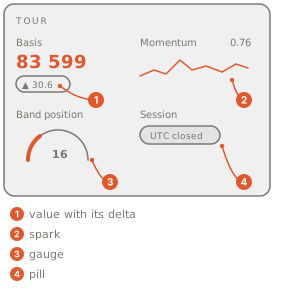
The card in the corner shows the basis with its change, a sparkline, a
dial and the regime chip, and follows every live tick. Resting the
cursor on a tile shows that tile again as a hover card, and a wheel over
the card still zooms the chart. The card keeps clear of the pane chrome:
the right anchors sit clear of the price axis, the bottom anchors clear
of the time axis, and safe_area: true keeps the top anchors clear of
the legend and the pane action bar too. It disappears with its indicator
when the indicator is hidden or removed.
Moving a card
A viewer can move any card on their chart: drag it from anywhere on the
card (on a phone, hold its grip, then drag). Near one of the nine places
it snaps in and a label names the place ("Top right, under Market");
anywhere else it stays where it is let go. Option (Alt) drops it without
the snap, Esc cancels, and a double-click sends a moved card back. The
move is the viewer's, saved with the overlay on that chart; position
and offset stay the card's default, and the Position row on the
indicator's Style page (The Style page)
says where the card is and puts it back. A card moved into a place that
already holds cards joins the far end of its stack.
Surface, type and frame
Every word is optional and absent keeps today's card. Colours are
"#rrggbb", "#rrggbbaa" or a theme token ("theme.bg",
Styling).
output("basis", line, overlay, { color: "#2962ff", width: 2, label: "Basis", format: "price" });
render.hud("board", { position: "top_right", title: "Market", columns: 2, width: 260, offset: [12, 8], safe_area: true, background_color: "theme.bg", background_opacity: 0.85, border_color: "theme.grid", corner_radius: 10, font_family: "mono", accent_color: "theme.up", chrome: "brackets", tiles: [tile.value("Basis", "basis", { format: "price", headline: true })] });- Size and place:
width(80..1200 px; default 300, 180 at one column),offset: [x, y](each -4096..4096 px; x moves inward from a left or right edge and y inward from the top or bottom, signed on the centre and middle anchors),z(an integer; cards in one anchor stack by it, lower nearer the anchor),safe_area: true(a top-left card starts under the legend, top-centre and top-right cards under the pane action bar, right-hand cards clear of the price-axis tags;offsetapplies from the cleared edge),mobile: true(the card shows on phones too, with pointer-free tiles and at most the larger of 140 px and 60 percent of its own width; absent, phones keep the chart as it is). - Surface:
background_color,background_opacity(0..1, default 0.92),background_gradient(2 to 8 colours) withgradient_direction("vertical", the default, or"horizontal"),border_color,border_width(0..10, default 1),border_style("solid","dashed","dotted"),corner_radius(0..32, default 12),padding(0..24),shadow(default true),opacity(0..1, the whole card). - Type:
text_color,title_text_color(default the muted ink),font_family("ui", the app font;"mono";"serif";"rounded"; each a system stack, nothing downloads),title_caseandlabel_case("none","upper","lower","small_caps"; the title is upper and labels are as written by default; values and numbers never change case),text_glow(0..8 px, a static halo in the text colour). - Accent:
accent_color(default"theme.accent") inks every gauge, meter fill, spark and headline that declares no colour of its own;accent_color_byplusaccent_colors(2 to 8) make the whole card follow an output per bar (green rising, red falling), and the pair excludesaccent_color. - Frame:
chromeis"card"(today's box),"none"(no box, text over the chart; pair it with a translucent background),"brackets"(four corner marks in the accent),"rules"(a thick and a thin rule above the title),"tag"(a small accent block at the top left),"title_bar"(the title on a full-width bar in the accent),"window"(bevelled edges and a two-colour title bar, its buttons decoration only) or"cover"(a square tile left of the title holding the chart's base asset over the accent gradient);textureis"none"or"scanlines"(static 1 px lines every 3 px).
A flat card that takes its colour from the data: a dashed hairline border, no drop shadow, the title in the full text ink, and every gauge, meter fill, spark and headline inked by the sign of the bar's basis change, red falling and green rising. Reach for it when the card should read as part of the chart, not as a window over it.
output("basis", line, overlay, { color: "#2962ff", width: 2, label: "Basis", format: "price" });
output("basis_chg", none);
output("rsi", line, lower, { color: "#8b5cf6", label: "RSI", format: "0.0" });
// 0 on a bar where the basis fell, 1 where it rose: the whole card's accent follows it.
output("basis_dir", none);
render.hud("flat", {
  position: "top_right",
  title: "Basis",
  tiles: [tile.value("Basis", "basis", { format: "price", delta: "basis_chg", headline: true }), tile.gauge("RSI", "rsi", { min: 0, max: 100, format: "int" })],
  accent_color_by: "basis_dir",
  accent_colors: ["theme.down", "theme.up"],
  border_style: "dashed",
  border_width: 1,
  padding: 14,
  shadow: false,
  title_text_color: "theme.text",
});
An instrument readout: mono type, the title and labels in capitals, a soft halo on the text, scanlines over the surface and bracket corners instead of a box. Reach for it on a dark chart where the card should look like a gauge cluster rather than a dialog.
output("rsi", line, lower, { color: "#8b5cf6", label: "RSI", format: "0.0" });
render.hud("instrument", {
  position: "bottom_left",
  title: "RSI",
  tiles: [tile.gauge("Level", "rsi", { min: 0, max: 100, format: "int", draw: "ticks" }), tile.spark("Trend", "rsi", { bars: 32 })],
  text_color: "#7DF9FF",
  font_family: "mono",
  title_case: "upper",
  label_case: "upper",
  text_glow: 4,
  texture: "scanlines",
  chrome: "brackets",
});
A pocket card that shows on phones too: one column, a fixed 160 px
width, a small inset, no shadow, and safe_area so it starts under the
legend. Absent mobile, a phone keeps the chart as it is and the card
stays a desktop readout.
output("basis", line, overlay, { color: "#2962ff", width: 2, label: "Basis", format: "price" });
output("basis_chg", none);
render.hud("pocket", {
  position: "top_left",
  columns: 1,
  tiles: [tile.value("Basis", "basis", { format: "price", delta: "basis_chg" })],
  mobile: true,
  safe_area: true,
  width: 160,
  padding: 8,
  shadow: false,
});
Nothing on a card animates, blurs or loads from outside the chart, and no script ever writes CSS: a shared indicator cannot paint over the chart with anything the words above do not describe.
Looks
look stands for a whole row of the table below; any word declared
beside it wins, so a look is a starting point, not a cage. Absent, the
card keeps today's look untouched. The viewer can switch the look on the
indicator's Style page (The Style page),
where every HUD gets a Look row with "As made" first, unless the file
bound the look to a setting (below).
| look | surface | type | draws | chrome | palette |
|---|---|---|---|---|---|
default | the defaults above | the defaults above | arc, line, bar, capsule | card | adaptive |
glass | background #1c1c1ee6 (#f2f2f7e6 on a light chart), border #ffffff29 1 px, corner radius 22, padding 16, shadow | rounded, no title, headline 34 | gauge ring, spark area, meter bar, pill dot | card | adaptive |
stage | background gradient #2c6b46, #1b3a28, #121212, #121212 vertical, corner radius 10, padding 14 | ui, headline 30 bold, accent #1ed760 | gauge bar, meter split, spark line, pill text | cover | home |
signal | background #000000, border #1d1d1d 1 px, corner radius 14 | ui, headline 38, no title | spark line (height 78, a zero line), meter split | card | home; the whole card's accent follows accent_ |
terminal | background #000000, border #3a3a3a 1 px, corner radius 0, padding 6 | mono, title and labels upper, label ink #F7A21B, text #ffffff | gauge text, spark text, meter text, pill text | title_bar (bar #F7A21B, title ink #000000) | home |
broadsheet | background #F6F1E7, text #141414, corner radius 0, padding 14 | serif, title small_caps, headline 20 | spark dots, meter bar, pill text, rows with dot leaders | rules | home |
chart_ | background #ffffff, text #121212, corner radius 0, padding 14 | ui, no title | spark bars (height 96, the baseline at the meter mark), pill text | tag (#E3120B) | home |
dial | background #EBE8E1, text #1d1d1b, corner radius 16, padding 14, accent #E05A1E | ui, no title | gauge dial, meter scale, pill led | card | home |
grid | background #F2F1EC, text #111111, corner radius 0, padding 14, accent #E30613 | ui, headline 44 bold | spark line (ink), meter split (ink and accent), pill text | rules | home |
cockpit | background #030e12c2, corner radius 0, padding 12, text #7DF9FF, accent #FFB000 | mono, title and labels upper, text glow 6 | gauge ticks, meter segments, spark line, pill text | brackets | home |
phosphor | background #05160B, text #3BFF73, corner radius 12, padding 12 | mono, text glow 5 | gauge text, spark text, meter text, pill text | none | home; texture scanlines |
classic | background #C0C0C0, text #000000, corner radius 0, padding 8 | ui | gauge blocks, meter blocks, spark line, pill dot | window (bevels, a title bar from #000080 to #1084D0) | home |
A "home" look keeps its paper on a dark and a light chart alike (a
printed object does not invert); an "adaptive" look resolves its theme
tokens per theme. The "draws" column is each tile kind's draw default
under that look (Blocks and tiles); a tile that
declares its own draw keeps it.
To let the trader pick among looks you chose, bind look to a setting:
look: "@card_look" names a param.choice whose every choice is one of
the twelve looks. The build writes the setting's default look on the
card, and the card takes the picked look the moment the setting changes.
That setting's row is the look's one control: the Style page draws no
Look row for a bound card (its Position row stays), and any word declared
beside look still wins over the picked look.
param.choice("card_look", ["phosphor", "glass", "terminal"], "phosphor", { label: "Card look" });
render.hud("desk", { position: "top_right", title: "RSI", look: "@card_look", tiles: [tile.gauge("Level", "rsi", { min: 0, max: 100 })] });
Start from a look and change only what you must. phosphor with the
scanlines off, a softer glow, a card frame around it and an upper-case
title keeps its green-on-black type and its text-drawn tiles; every word
beside look wins.
output("rsi", line, lower, { color: "#8b5cf6", label: "RSI", format: "0.0" });
string("regime", { max_bytes: 16 });
render.hud("desk", {
  position: "top_right",
  title: "RSI",
  tiles: [tile.gauge("Level", "rsi", { min: 0, max: 100, format: "int" }), tile.pill("Regime", "regime")],
  look: "phosphor",
  texture: "none",
  text_glow: 2,
  chrome: "card",
  title_case: "upper",
});
The rules, each refused by name when broken:
columnstakes 1 or 2; apositionoutside the nine anchors is refused.look,chrome,texture,title_case,label_case,font_familyand a tile'sdrawoutside their words are refused by name, with the list; so arewidthoutside 80..1200,offsetoutside -4096..4096,corner_radiusoutside 0..32 andtext_glowoutside 0..8.look: "@name"naming no setting, or a setting that is not aparam.choiceover looks only, is refused by name (render.hud 'desk' look references "@ink", which is not a param.choice over default|glass|...);lookis the card's only word a setting can drive, so a card colour stays a literal.accent_colorbesideaccent_color_byis refused, and the ladder needs itsaccent_colors.- One headline tile per card: a second
headline: trueis refused. - A corner readout is a HUD card, a
render.labelwith aposition, or a one-cell table; a label placed byxandysits at its price. - A presentation name used twice is refused.
- The HUD is drawn where the indicator runs in the browser; a phone
shows a card only when it declares
mobile: true.
Hover cards
hover: [...] on an output, render.text or render.label, or
hover(handle, [...]) at the top level, is the card the cursor opens,
from the block kit under the block.* name: one card per output, either
form. Without one the surface shows the output's tooltip, else its
label and value (Labels, tooltips, badges).
badges names another output, a ladder whose labels become chips on the
card.
const basis = output("basis", line, overlay, { color: "#2962ff", width: 2, label: "Basis", format: "price", tooltip: "{{label}} {{value:price}}" });
output("rsi", line, lower, { color: "#8b5cf6", label: "RSI", format: "0.0" });
output("basis_chg", none);
string("regime", { max_bytes: 16 });
hover(basis, [block.value("Basis", "basis", { format: "price", delta: "basis_chg" }), block.rows([["RSI", "rsi", "0.0"], ["Regime", "regime"]]), block.meter("RSI", "rsi", { min: 0, max: 100, marks: [30, 70] }), block.chips("regime")]);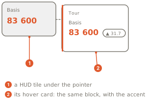
Where the card appears:
- a line: the output whose value at the cursor's bar sits nearest the cursor. On the price pane the line has to be within 12 pixels of the cursor; in an indicator's own lower pane the card follows the cursor's bar anywhere in the pane (a histogram answers over its whole column);
- a legend entry: the value under the cursor names its output;
- a HUD tile: the tile is shown again as a hover card;
- a text mark or a label: the
hoverlist on therender.textorrender.labelthat drew it (Plotting).
Around the blocks: hint on the output, or on a value block, adds its
words to the card; badges adds the chips of the ladder it names; the
card's edge takes the output's color, the current rung of its color_by
ladder when it has one, else its static color.
The rules, each refused by name when broken:
hovertakes an output handle first (bind a handle with a top-levelconst h = output(...)and passh), not a string literal.- One hover per output: inline or top-level, never both.
- A hover needs at least one block.
badgestakes ANOTHER output; an output badging itself is refused.- A table or a drawing shows no card.
- In a
tooltipor avaluetemplate an unknown name stays as written.
Blocks and tiles
The block kit is one vocabulary with two names: tile.* builds the
tiles of a render.hud(...) card, block.* the blocks of a
hover(...) card, the same constructors under their other name. A
constructor lives inside the card's literal only and is erased before the
compiler. value, spark, gauge and meter read a numeric output,
pill a string slot, chips either, rows a list of
[label, output or slot, format?] lines, and rings one to three
outputs each with its own range. Every block reads the newest
row, so a data-only output written per bar is the way to carry a delta or
a regime onto either card.
| Constructor | Draws | Options |
|---|---|---|
value(label, output, { format?, delta?, tooltip?, hint?, color?, color_by?, colors?, headline?, font_size? }) | the output's newest value under its label, a signed delta from the delta output beside it; headline: true spans every column of a HUD card at font_size (default 22) with a hairline under it | format one of the ten; delta an output; tooltip and hint words; font_size 6..64 (default 16) |
spark(label, output, { bars?, color?, color_by?, colors?, draw?, height? }) | a sparkline of the output's last bars (64 at most) | bars a positive integer; draw line (the default), area, dots, bars or text; height 16..120 px (default 28) |
gauge(label, output, { min, max, format?, color?, color_by?, colors?, draw? }) | a dial between min and max | min and max required, min below max; format one of the ten; draw arc (the default), ring, dial, ticks, bar, blocks or text |
meter(label, output, { min, max, marks?, color?, color_by?, colors?, draw?, height? }) | a bar between min and max with marks | min and max required, min below max; marks a list of numbers; draw bar (the default), split, blocks, segments, scale or text; height 16..120 px (default 4) |
pill(label, slot, { color?, color_by?, colors?, draw?, headline?, font_size? }) | the slot's words as a chip, colored by a ladder | draw capsule (the default), dot, led or text; headline and font_size as on value (default 10, 22 as a headline) |
rows(label?, [[label, output or slot, format?], ...], { color?, color_by?, colors?, leader? }) | rows of label and value | the caption may be left out: the rows array alone; the options object after it is optional too; leader none (the default) or dots, a dotted rule between each key and its value |
chips(slot or ladder output) | the slot's words, or the ladder's labels, as chips | none |
rings(label?, [[label, output, { min, max, color? }], ...], { height? }) | one to three concentric rings, outermost first, each the share of its own min..max its output holds, with a legend beside them (dot, label, value) | 1..3 entries, min below max; color a colour word (default the accent at full, 70 and 45 percent strength); height 16..120 px (default 86) |
The ten formats are price, %, si, int, 0, 0.0, 0.00,
0.000, usd ($1.2M) and auto (six significant digits with ,
thousands) (Styling).
Colour: every block takes color (a colour word: "#rrggbb",
"#rrggbbaa" or a theme token such as "theme.up") or a color_by
output plus a colors ladder; with both, the ladder wins and color is
the fallback where the index is not finite. Absent, the block keeps its
ink: marks in the output's colour, text in the card's text colour, or the
look's default on a HUD card that declares a look. A rows block's
colour inks every value in it.
What the draw words mean: ring is one circular track; dial a
printed dial with ticks every 5 and a needle over 270 degrees; ticks a
half arc with a tick every 10 and the value in the middle; bar a track
with a knob; blocks a segmented progress bar; text block characters
in the card's font (a gauge or meter as ████▌····· over 10 cells, a
spark as ▁▂▃▄▅▆▇█ over at most 16 cells); area the line plus a faint
fill and an end dot; dots a stippled line; bars one column per bar
from the first meter mark or zero; split the fill in the accent and the
rest in theme.down, with labels at both ends; segments 20 cells;
scale a tuning scale with a pointer; capsule today's tinted pill;
dot the word in its colour after a small dot; led a lit lamp before
the word; and text on a pill the word alone in its colour. A hover card
keeps today's drawings unless the block declares draw.
A reading column on a HUD card: an area spark taller than the default, a split meter with its marks, and rows with dotted leaders between each label and its value. Reach for the taller spark when the card has the room, and for the leaders when a label sits far from its value.
output("rsi", line, lower, { color: "#8b5cf6", label: "RSI", format: "0.0" });
string("regime", { max_bytes: 16 });
render.hud("column", {
  position: "middle_right",
  columns: 1,
  tiles: [
    tile.spark("RSI", "rsi", { bars: 48, draw: "area", height: 48 }),
    tile.meter("Level", "rsi", { min: 0, max: 100, marks: [30, 70], draw: "split", height: 16 }),
    tile.rows("Readout", [["RSI", "rsi", "0.0"], ["Regime", "regime"]], { leader: "dots" }),
  ],
});
An options-desk tile: three rings, outermost first, the calls' share of open interest, the puts' share and the IV rank, each over its own range and in its own ink, with the legend beside them. Reach for rings when three shares belong together and a bar each would read as three unrelated meters.
// Each share is 0 to 1 and the IV rank 0 to 100: a ring fills by its output's place in its own range.
output("calls_share", none);
output("puts_share", none);
output("iv_rank", none);
render.hud("options_desk", {
  position: "top_right",
  title: "Options desk",
  columns: 1,
  tiles: [
    tile.rings("Positioning", [
      ["Calls", "calls_share", { min: 0, max: 1, color: "theme.up" }],
      ["Puts", "puts_share", { min: 0, max: 1, color: "theme.down" }],
      ["IV rank", "iv_rank", { min: 0, max: 100, color: "theme.accent" }],
    ], { height: 96 }),
  ],
});
Outputs and slots are named by a bound handle or by their name as a
string: tile.value("Basis", basis, ...) with const basis = output("basis", ...) above it, or tile.value("Basis", "basis", ...).
The sheet records the name either way.
The rules, each refused by name when broken:
- A card takes block constructors (
block.<kind>(...)ortile.<kind>(...)), kindsvalue,spark,gauge,pill,rows,meter,chips,rings, and needs at least one. gaugeandmeterare refused withoutminandmax, and needminbelowmax; so does each ring.barstakes a positive integer literal;colorsneeds at least one color.- A
pillreads a string slot,chipsa slot or a ladder output, the numeric kinds an output; a block whose output or slot does not exist is refused. drawon avalue,rowsorchipsblock, or a word outside the kind's own list, is refused by name ("spark draw must be one of ...");headlineon a kind other thanvalueorpill, two headline tiles in one card, andheighton a kind other thanspark,meterorringsare refused too.- A spark's
coloror a pill'scolorsis a literal (a theme token counts): a setting paints an output, a renderer or a legend entry only, never a block. - A block has no size, alignment or color of its own beyond these options: the chart draws it.
HUD starters
Six complete cards to start from, under HUDs in the editor's template picker, each in one of the looks. Each answers one question first, as its headline, and reads the numbers behind it underneath:
- Market HUD, glass: the trend, then RSI, the taker buy share and the last closed bar's volume on three rings, ATR and the open-interest change in coins.
- Decision board, broadsheet: a headline counting the six factors, the net score as a stippled line and the factors in rows with dotted leaders.
- Order flow HUD, chart desk: who is pushing price, each bar's buy share as bars from the 50 mark, the window's buy share, the net delta and the liquidations.
- Order book HUD, cockpit: the heavier side of the book, the bid share in segments, the dollars resting by distance from the mid and the biggest walls.
- Session HUD, stage: the session trading now, how much of it has passed, the session up next, the day's range used and the distance from the VWAP and the prior day's high and low.
- Gamma map, terminal: dealer gamma at spot, net GEX, spot against the gamma flip and the four levels as numbered rows.
The other widgets
The HUD card is one of six widgets that share a vocabulary. The status
card, the feed and the meter (draw.card, draw.feed, draw.meter)
take the HUD's surface words plus a chrome of their own, the ladder
(draw.ladder) its own short list, and the stats row under the price
pane (render.stats_row) a colour ladder and a priority. Their
contracts, with the full tables, are on
Cards, frames and panels and
Plotting; this section
shows them as looks. Every word is optional and absent keeps today's
widget.
A status card without the state chrome: no state word, no stripe, no hide or collapse glyphs until the viewer hovers it, painted over your drawings, a hairline in the grid colour between the headline and the rows, a small medium-weight title and muted labels. Reach for it when the card is a dashboard, not an alarm.
output("pnl", none);
output("trades", none);
output("win_rate", none);
draw.card("session", {
  title: "{{symbol}} session",
  anchor: "top_left",
  headline: { output: "pnl", format: "usd", signed: true },
  rows: [
    { label: "Trades", value: { output: "trades", format: "int" } },
    { label: "Win rate", value: { output: "win_rate", format: "%", decimals: 1 } },
  ],
  show_state: false,
  stripe: false,
  controls: "none",
  above_drawings: true,
  rule_color: "theme.grid",
  title_font_size: 11,
  title_font_weight: "medium",
  label_text_color: "theme.muted",
});
An alarm card: the state word and the stripe on, the four state inks declared, the hide and collapse glyphs always visible, a hairline under the headline, a clock row and a countdown to the next close. Reach for it when the card is the indicator's alarm panel.
output("spread", none);
// 0 ok, 1 armed, 2 fired, 3 error: the card's state word and inks follow it.
output("alert_state", none);
output("close_at_ms", none);
draw.card("alarm", {
  title: "Spread alarm",
  anchor: "top_right",
  state_by: "alert_state",
  headline: { output: "spread", format: "0.00" },
  rows: [
    { label: "Now", clock: true },
    { label: "Next close", countdown_to: { output: "close_at_ms" } },
  ],
  show_state: true,
  stripe: true,
  controls: "always",
  state_colors: ["theme.muted", "theme.accent", "theme.up", "theme.down"],
  rule: true,
});
A meter with a thicker bar on a grey track, and a feed that prints each
line's clock time, both showing their hide and collapse glyphs on hover
only. Reach for the thicker bar when the meter stands alone in a corner;
time_format: "none" drops the time column when the times add nothing.
output("rsi_fraction", none);
string("rsi_text", { max_bytes: 8 });
const events = frame("events", { max_bytes: 2048 });
draw.meter({ name: "rsi_meter", label: "RSI", fraction: { output: "rsi_fraction" }, ramp: ["#3b82f6", "#64748b", "#ef4444"], text: { slot: "rsi_text" }, anchor: "top_left", bar_height: 8, track_color: "theme.grid", controls: "hover" });
draw.feed({ name: "rsi_events", frame: events, anchor: "bottom_left", title: "Crossings", time_format: "HH:mm", controls: "hover", stripe: false });
The feed's frame as the script writes it: one to fifty lines of a time
in milliseconds, a text of at most 80 characters and an optional colour,
newest first, and a per-run title that replaces the declared one.
{
  "title": "Crossings",
  "lines": [
    [1759536000000, "RSI crossed above 70", "#ef4444"],
    [1759532400000, "RSI crossed below 30", "#3b82f6"]
  ]
}
A slim mono ladder with its row labels on and the divider line in the
accent colour. The divider itself comes with the frame (its divider, a
label and a price); divider_color inks it.
output("close_line", line, overlay, { color: "#94a3b8", label: "Close" });
const rows = frame("rows", { max_bytes: 2048 });
draw.ladder({ name: "volume_by_price", frame: rows, side: "right", width_frac: 0.12, labels: true, font_family: "mono", font_size: 10, color: "#64748b", divider_color: "theme.accent" });
The ladder's frame: one to 256 rows of a price, a size, the bar's
length from 0 to 1 and an optional colour, and a divider that marks one
price. A divider in the frame replaces a declared one.
{
  "rows": [
    [63950, 1820, 0.62, "#64748b"],
    [64000, 2940, 1, "#f59e0b"],
    [64050, 1210, 0.41, "#64748b"]
  ],
  "divider": { "label": "Last", "price": 64010 }
}
Two rows in the statistics strip: a diverging row whose bull and bear
inks are the colors pair, kept readable longest as bars narrow
(priority: 1), and a row inked per bar by a packed colour the script
writes (color_packed_by, Colors), the
first to lose its text (priority: 3).
output("basis_chg", none);
output("rsi", line, lower, { color: "#8b5cf6", label: "RSI", format: "0.0" });
// A packed colour per bar, written with toPacked(...) from the colors kit.
output("rsi_ink", none);
render.stats_row("basis_row", { output: "basis_chg", title: "Basis chg", format: "price", polarity: "diverging", colors: ["theme.up", "theme.down"], priority: 1 });
render.stats_row("rsi_row", { output: "rsi", title: "RSI", format: "0.0", color_packed_by: "rsi_ink", priority: 3 });
Related
Cards, frames and panels
The status card, the ladder, the feed and the meter in full
What the chart shows
The three surfaces together, with a complete module
Legend
The legend entry, and color_by on it
Labels, tooltips, badges
The tooltip
template a card falls back to, and badges
Plotting
The outputs, string slots and renderers a card reads