Pages, sections, dividers, notes
The layout words are top-level statements, and source order is the layout: each word applies to the settings declared after it.
What it is
Four words lay the dialog out, top-level statements like the settings
themselves: page(title), section(title, { toggle?, collapsed?, when? }), divider() and note(text). They are sheet-only,
compiled to nothing: the module receives the same numbers whether or not
the file lays its dialog out. A file with no layout word and no group
keeps one flat list.
Declare it
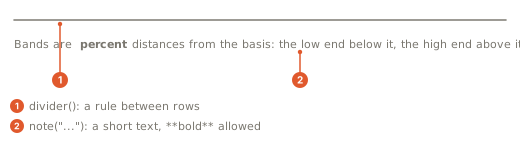
page(title)starts a page. Pages are entries in the dialog's left rail, in order, above a Chart caption that holds the chart's own entries. Settings declared before the firstpage(...)land on General.section(title, { toggle?, collapsed?, when? })starts a section on the current page.toggleputs aparam.boolin the section's header and dims its rows while the toggle is off;collapsed: truestarts the section folded, with its row count in the header;whendims the section by a toggle declared elsewhere.toggleandwhentake the toggle's HANDLE: bind it withconst show = param.bool(...)and passshow.divider()draws a rule between rows.note(text)puts a line of words between rows;**bold**is the one markup.
{ group: "Signals/Labels" } on a setting is the one-line form: it opens
the page and the section it names when they are not already open.
A moving-average pair with two pages, a row of two fields, a section that carries its toggle, a folded section and a gated slider:
page("Lengths");
// Two fields on one line of the dialog, the first with a hint.
param.int("fast", 9, { min: 1, max: 200, row: "lengths", hint: "Bars in the fast average" });
param.int("slow", 21, { min: 2, max: 400, row: "lengths" });
note("Keep the fast length **below** the slow one.");
page("Look");
// The handle lets the section below carry this toggle in its header.
const showSlow = param.bool("show_slow", true, { label: "Slow line" });
section("Slow line", { toggle: showSlow });
param.color("slow_color", "#f59e0b", { label: "Color" });
param.choice("slow_style", ["solid", "dashed", "dotted"], "dashed", { label: "Line style" });
divider();
section("Fine tuning", { collapsed: true });
param.bool("smooth", false);
// Dimmed until the toggle it names is on.
param.number("smoothing", 0.3, { min: 0, max: 1, step: 0.05, slider: true, when: "smooth" });
output("fast", line, overlay, { color: "#3b82f6", width: 2 });
// The color and the line style follow the two settings above, by name.
output("slow", line, overlay, { color: "@slow_color", line_style: "@slow_style", width: 2 });
What the dialog draws
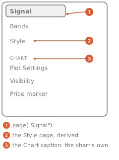
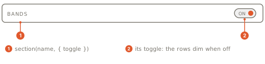
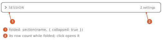
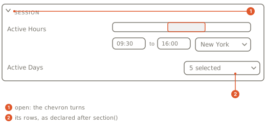
A section's toggle is drawn in the header and never as a row of its own;
it stays a declared setting, so its value is saved like any other. Rows
that name the same row word render as a pair, and dividers and notes
render between rows. The pages you declare come first on the rail, then
the Style page the dialog derives from your outputs
(The Style page), then the chart's own entries under
Chart.
Gotchas
toggleandwhenon a section take the toggle's HANDLE, bound with a top-levelconst;whenon a setting takes the toggle's NAME (Options on a setting).groupalone is enough to open pages:{ group: "Page/Section" }on a setting writes the same layout the words do, and only a file with no layout word and nogroupkeeps one flat list.**bold**is the one markup anotetakes.- A composite (a range, a list, a session, a number with a unit) is placed
once, where its declaration sits; a hidden
market.*setting takes no place in the layout.