
The plotting functions are how an indicator displays data. The universal plot() covers most cases; the plotLine/plotBar/plotHistogram/plotCandle/plotShape variants offer chart-type-specific defaults; plotText/plotLabel/plotTable/plotRange add chart annotations. The foreign-pane trio plotMatrix/plotCurve/plotTiles is different in kind: each emits a whole offchart pane that ignores the time axis, documented on Foreign-Domain Panes.
| Function | Description |
|---|---|
plot | Universal plot — line, bar, candle, point |
plotLine | Line chart with enhanced styling |
plotBar | OHLC bar chart |
plotHistogram | Baseline-anchored histogram columns |
plotCandle | Candlestick chart |
plotShape | Custom shapes / markers |
plotBatches | Many markers per bar via a batch loop |
plotPie | Per-bar pie chart anchored to a price |
plotText | Text label at a price level |
plotPriceLabel | Per-bar callout / icon anchored at a price |
plotLabel | Fixed-position text label |
plotTable | Fixed-position table |
plotRange | Rectangular box between two time/price points |
plotMiniChartGrid | Viewport-pinned grid of mini OHLC panels |
plotStatRow | Per-bar row in the statistics strip |
plotMatrix | Categorical grid in a foreign-domain pane (rows × columns, not time) |
plotCurve | Function curve over a numeric X in a foreign-domain pane (not time) |
plotTiles | KPI card dashboard in a foreign-domain pane (stat tiles, not time) |
hline | Horizontal reference line |
plotBgColor | Background color band |
plot
Use plot() when you want one flexible renderer that can display the same source data as a line, spline, histogram bar, candlestick, or point series. It is useful for generic helpers and configurable indicators where the plot style may change based on user input.
plot(value, plotType?, width?, colors?, colorIndex?, fill?, smooth?, showPriceDisplay?, label?, desc?, lineStyle?, glow?) — universal plotting function.
| Parameter | Type | Description |
|---|---|---|
value | TimeSeries | Data series to visualize |
plotType | string | "spline"/"line" for lines, "bar" for histogram, "candle" for OHLC, "point" for dots |
width | number | Thickness of lines or size of bars/points (1–5) |
colors | string[] | Color array — format depends on plot type and fill mode |
colorIndex | string | number | Per-bar color override |
fill | boolean | 'momentum_fill' | true for area fill; 'momentum_fill' for a two-line conditional fill (colors the band between a value line and a baseline by sign). 'momentum_fill' requires value to be a [series, baseline] pair (e.g. [macdLine, 0]) plus a 4-color array — a single value renders nothing. |
smooth | boolean | Smooth line curves |
showPriceDisplay | boolean | Show current value in the price scale (default: false) |
label | string[] | Legend labels per series |
desc | string[] | Long descriptions per series |
lineStyle | string | Stroke pattern for line-type plots: "solid" (default) | "dashed" | "dotted". No effect on bar / candle / point. |
glow | boolean | number | Soft halo around the stroke. true = default blur in series color; number = blur radius in px (clamped 0–30, 0 disables). |
//@version=2
define(title="plot() styles", position="offchart", axis=true)

timeseries d = ohlcv(symbol=currentSymbol, exchange=currentExchange)
timeseries smaData = sma(source=d.close, period=20)

// One renderer, many styles: switch plotType between line, bar, candle, point.
plot(value=smaData, plotType="spline", width=2, colors=["#2196f3"], label=["SMA"], desc=["smoothed close"])
plotLine
Renders data as enhanced line charts for indicators like moving averages, RSI, momentum, bands, and other continuous values. Use it when you need line width control, smoothing, area fills, momentum fills, per-bar color selection, or multiple plotted series.
plotLine(value, width?, colors?, colorIndex?, fill?, smooth?, showPriceDisplay?, label?, desc?, lineStyle?, glow?) — line chart with enhanced styling options.
| Parameter | Type | Description |
|---|---|---|
value | TimeSeries | Data series to plot as lines |
width | number | Line width (default: 2) |
colors | color[] | Color array (default: ['orange']) |
colorIndex | string | number | Per-bar color override |
fill | boolean | 'momentum_fill' | 'default' | Fill options for area under lines (default: false). 'momentum_fill' is a two-line fill that requires value to be a [series, baseline] pair and a 4-color array; a single value renders nothing. |
smooth | boolean | Enable smooth line rendering (default: false) |
showPriceDisplay | boolean | Show current value in price scale (default: false) |
label | string[] | Legend labels |
desc | string[] | Long descriptions |
lineStyle | string | Stroke pattern: "solid" (default) | "dashed" | "dotted" |
glow | boolean | number | Soft halo around the stroke. true = default blur in series color; number = blur radius in px (clamped 0–30, 0 disables). |
Visual Example
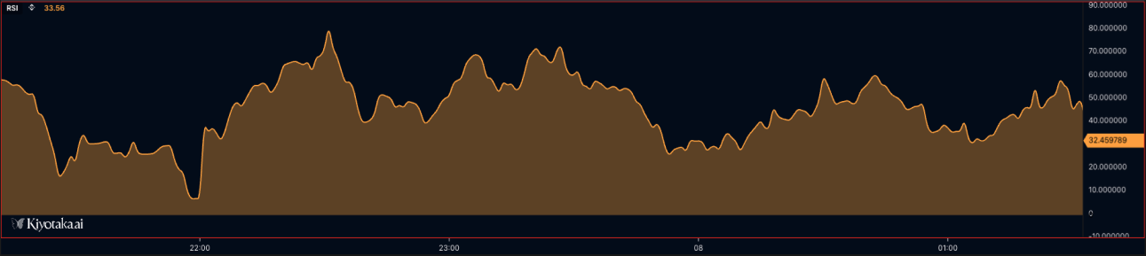
//@version=2

// Simple line with solid fill
plotLine(value=sma20, width=2, colors=["#2196f3"], fill=true, smooth=true, label=["SMA 20"], desc=["20-period Simple Moving Average"]);

// Line with no fill (line only)
plotLine(value=ema50, width=2, colors=["#ff6b35"], fill=false, smooth=true, label=["EMA 50"], desc=["50-period Exponential Moving Average"]);

// Line with 30% opacity fill
plotLine(value=rsi, width=2, colors=["#9c27b0"], fill=0.3, smooth=true, label=["RSI"], desc=["Relative Strength Index"]);

// Using colorIndex to select specific color from array
plotLine(value=rsiData, width=2, colors=["#ff0000", "#00ff00", "#0000ff"], colorIndex=1, fill=true, smooth=true, label=["RSI"], desc=["RSI with Green Color"]); // Uses green (index 1)

// MOMENTUM FILL - two-line conditional fill. It colors the band between a value
// line && a baseline by sign, so `value` MUST be a [series, baseline] pair — a
// single series renders nothing. Needs a 4-color array:
// [posLineColor, negLineColor, posFillColor, negFillColor].
plotLine(value=[momentum, 0], width=2, colors=[
    "#00ff88",   // Color 0: line color when value > baseline
    "#ff4444",   // Color 1: line color when value < baseline
    "#00ff8830", // Color 2: fill color when value > baseline
    "#ff444430"  // Color 3: fill color when value < baseline
], fill="momentum_fill", smooth=true, label=["Momentum", "Zero"], desc=["Momentum with Conditional Fill", "Baseline"]);
// When momentum > 0: uses colors[0] for line, colors[2] for fill
// When momentum < 0: uses colors[1] for line, colors[3] for fill

// Example: MACD histogram-style momentum fill (fill the MACD line against a zero baseline)
timeseries macdData = macd(close, 12, 26, 9);
plotLine(value=[macdData, 0], width=1, colors=[
    "#26a69a", // Bullish line
    "#ef5350", // Bearish line
    "#26a69a40", // Bullish fill (25% opacity)
    "#ef535040"  // Bearish fill (25% opacity)
], fill="momentum_fill", smooth=false, label=["MACD", "Zero"], desc=["MACD Histogram", "Baseline"]);

// Multiple lines with different fill styles
plotLine(value=fastMA, width=2, colors=["#00ff88"], fill=0.2, smooth=true, label=["Fast MA"], desc=["Fast Moving Average"]);  // Semi-transparent
plotLine(value=slowMA, width=3, colors=["#ff4444"], fill=true, smooth=true, label=["Slow MA"], desc=["Slow Moving Average"]);  // Solid fill
plotBar
Renders data as vertical bars, commonly used for volume, histograms, deltas, and positive/negative oscillator values. Use colors and colorIndex to distinguish bullish/bearish or above/below-zero states.
plotBar(value, width?, colors?, colorIndex?, showPriceDisplay?, label?, desc?, glow?) — bar chart.
| Parameter | Type | Description |
|---|---|---|
value | TimeSeries | OHLC data series |
width | number | Bar width (default: 1) |
colors | color[] | [bullish, bearish] (default: ['orange', 'green']) |
colorIndex | string | number | Per-bar color override |
showPriceDisplay | boolean | Show current value in price scale (default: false) |
glow | boolean | number | Soft halo around each bar. true = default blur; number = blur radius in px (clamped 0–30, 0 disables). |
Visual Example
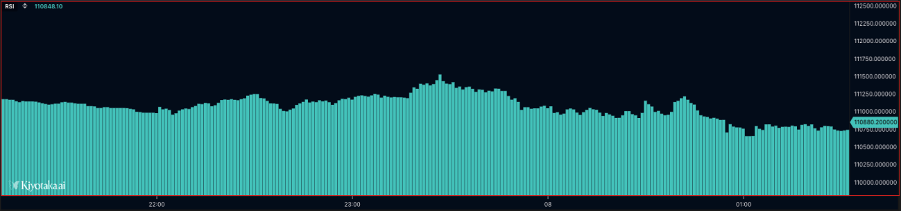
//@version=2

define(title="Volume Bars", position="offchart", axis=true);

timeseries ohlcvData = ohlcv(symbol=currentSymbol, exchange=currentExchange);
plotBar(value=ohlcvData.volume, width=1, colors=["#4ecdc4", "#ff6b6b"], label=["Volume"], desc=["Trading Volume Bars"]);
plotHistogram
Renders a single value series as vertical columns grown from a fixed baseline. This is the native renderer for MACD-style momentum, volume delta, tape pressure, and any oscillator you read around a level: each bar draws one column from base (default 0) to that bar's value, and per-bar colors flip cleanly on sign via colorIndex. It takes exactly one value per bar; [low, high] range pairs belong to plotBar.
plotHistogram(value, base?, colors?, colorIndex?, width?, showPriceDisplay?, label?, desc?, glow?) — baseline-anchored histogram.
| Parameter | Type | Description |
|---|---|---|
value | TimeSeries | Single value per bar. Arrays are rejected; plotBar owns [low, high] ranges. |
base | number | Baseline the columns grow from (default: 0) |
colors | color[] | Palette; with colorIndex, the per-bar pick |
colorIndex | string | number | Per-bar palette index or direct color |
width | number | Column width (default: 1; keep at or below 1 so neighbors never overlap) |
showPriceDisplay | boolean | Show current value in price scale (default: false) |
glow | boolean | number | Soft halo, same semantics as plotBar |
plotHistogram(value, base?, width?, colors?, colorIndex?, glow?, showPriceDisplay?, tooltip?, zOrder?, tag?, label?, desc?) renders single-value columns from a baseline.
| Parameter | Type | Description |
|---|---|---|
value | TimeSeries | Single value series; each bar draws one column spanning from base to the value. Arrays are rejected (see below). |
base | number | Baseline the columns grow from (default: 0). Any number works, e.g. base=100 draws values around 100. A non-number is a compile-time error. |
width | number | Column width (default: 1) |
colors | color[] | Color palette for the columns; pair with a numeric colorIndex to select per bar |
colorIndex | string | number | Per-bar color override: an index into colors, or a color string used directly (in which case colors can be omitted entirely) |
glow | boolean | number | Soft halo around the columns; a number sets the blur radius (default: false) |
showPriceDisplay | boolean | Show current value in the price scale |
tooltip | string | Hover tooltip (see Styling) |
zOrder | number | Stacking order among plots (see Styling) |
tag | string | Optional output tag: "none", "exchange", or "symbol" (see the rejection notes below) |
label | string[] | Legend label, one entry (required by the editor build) |
desc | string[] | Long description (optional) |
A value of na draws no column for that bar: derive the series from a 20-period average and the first 19 bars stay empty, with columns starting once the average has data.
The basic form, volume as columns with the style passthroughs:
//@version=3

// Volume as histogram columns grown from the default base (0), with the
// style passthroughs: width, glow, tooltip, zOrder, tag, showPriceDisplay.
define(title="Volume Histogram", position="offchart", axis=true);

timeseries data = ohlcv(symbol=currentSymbol, exchange=currentExchange);
var volume = data.volume;

plotHistogram(
  value=volume,
  colors=["#26a69a"],
  width=2,
  glow=false,
  showPriceDisplay=true,
  tooltip="Volume",
  zOrder=1,
  tag="symbol",
  label=["Volume"],
  desc=["Trading volume histogram"]
);
The classic MACD histogram: an explicit base=0 and a numeric colorIndex that flips the palette entry on sign:
//@version=3

// MACD histogram around an explicit base=0, with dynamic colors via a
// numeric colorIndex: the palette index flips on the sign of the value.
define(title="MACD Histogram", position="offchart", axis=true);

var colors = input(name="colors", type="color[]", defaultValue=["green", "red"], label="Colors");

timeseries data = ohlcv(symbol=currentSymbol, exchange=currentExchange);

var output = macd(source=data, fastPeriod=12, slowPeriod=26, signalPeriod=9);
var histogram = output[2];

var idx = (histogram >= 0) ? 0 : 1;

plotHistogram(
  value=histogram,
  base=0,
  colors=colors,
  colorIndex=idx,
  width=1,
  label=["MACD Histogram"],
  desc=["MACD histogram columns from base 0"]
);
The baseline can sit anywhere, not just at zero:
//@version=3

// Columns grow up or down from base=100 as close oscillates around 100,
// the offset-baseline form of the histogram contract.
define(title="Histogram From Base 100", position="offchart", axis=true);

timeseries data = ohlcv(symbol=currentSymbol, exchange=currentExchange);
var close = data.close;

var idx = (close >= 100) ? 0 : 1;

plotHistogram(
  value=close,
  base=100,
  colors=["#22c55e", "#ef4444"],
  colorIndex=idx,
  label=["Close vs 100"],
  desc=["Close plotted as columns grown from base 100"]
);
colorIndex also accepts a color string directly, in which case the colors palette can be omitted:
//@version=3

// Dynamic colors via a STRING colorIndex: the per-bar color string is used
// directly, so the colors palette can be omitted entirely.
define(title="Direction-Colored Volume", position="offchart", axis=true);

timeseries data = ohlcv(symbol=currentSymbol, exchange=currentExchange);
var open = data.open;
var close = data.close;

var barColor = (close >= open) ? "#22c55e" : "#ef4444";

plotHistogram(
  value=data.volume,
  colorIndex=barColor,
  label=["Volume"],
  desc=["Volume colored by candle direction via string colorIndex"]
);
What plotHistogram rejects
- Array values. Passing
value=[low, high]fails at runtime withplotHistogram takes a single value series; use plotBar for [low, high] ranges. The editor build flags the same script even earlier, because strict label counting follows the array arity:Plot function 'histogram' has insufficient labels. Expected 2 label(s) but got 1. - Batching. Calling it inside a
plotBatchescallback is a compile-time error:plotBatches: 'plotHistogram' is not supported inside a plotBatches callback yet — only plotBar, plotShape, plotRange, plotPriceLabel and plotPie can be batched(with the call's line and column). - A non-number
base.base="not-a-number"stops the build withType mismatch for 'plotHistogram.base': expected number, got string(with the call's line and column). - A missing
label. The engine alone runs the script, but the editor build blocks it:Plot function 'histogram' is missing the 'label' parameter. Expected 1 label(s) for 1 data series.See Thelabelrequirement. - Unknown
tagvalues.tag="vol-hist"fails at runtime withInvalid tag value: 'vol-hist'. Must be one of: 'none', 'label', 'exchange', 'symbol'. One quirk to know: despite appearing in that list,tag="label"is itself rejected with the same error. The values that actually work are"none","exchange","symbol", or omittingtag.
plotCandle
Renders OHLC data as candlesticks. Use it for price-style visualizations, custom candle coloring, or derived candle series where each bar has open, high, low, and close values.
plotCandle(value, width?, colors?, colorIndex?, showPriceDisplay?, label?, desc?, glow?) — candlestick chart from OHLC data.
| Parameter | Type | Description |
|---|---|---|
value | TimeSeries | OHLC data series |
width | number | Candle width (default: 1) |
colors | color[] | [bullish, bearish] (default: ['orange', 'green']) |
colorIndex | string | number | Per-bar color override |
showPriceDisplay | boolean | Show current value in price scale (default: false) |
glow | boolean | number | Soft halo around each candle. true = default blur; number = blur radius in px (clamped 0–30, 0 disables). |
Visual Example
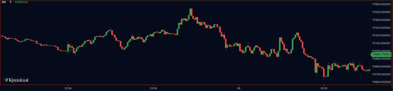
//@version=2

define(title="Candlestick Chart", position="offchart", axis=false);

timeseries ohlcvData = ohlcv(symbol=currentSymbol, exchange=currentExchange);
plotCandle(value=ohlcvData, width=1, colors=["#4caf50", "#f44336"], label=["Price"], desc=["OHLC Candlestick Chart"]);
plotShape
Renders markers at specific values on the chart, such as signal dots, crossover markers, or event highlights. Use na for bars where no marker should be drawn, and pass a visible value only when the signal exists.
plotShape(value, shape, width?, colors?, colorIndex?, fill?, showPriceDisplay?, label?, desc?, glow?) — custom shapes / markers.
| Parameter | Type | Description |
|---|---|---|
value | TimeSeries | Data series for shape positioning |
shape | ShapeType | Shape type: 'circle', 'triangle', 'cross', 'diamond' |
width | number | Shape border width (default: 2) |
colors | color[] | Color array (default: ['orange']) |
colorIndex | string | number | Per-bar color override |
fill | boolean | 'momentum_fill' | 'default' | Fill options |
showPriceDisplay | boolean | Show current value in price scale (default: false) |
glow | boolean | number | Soft halo around each shape. true = default blur; number = blur radius in px (clamped 0–30, 0 disables). |
Visual Example
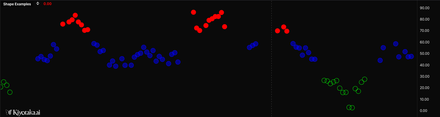
//@version=2

// Basic circle shape - solid fill
plotShape(
  (value = buySignals),
  (shape = 'circle'),
  (width = 3),
  (colors = ['#00ff00']),
  (fill = true),
  (showPriceDisplay = true),
  (label = ['Buy']),
  (desc = ['Buy Signal Markers']),
);

// Circle with no fill (outline only)
plotShape(
  (value = sellSignals),
  (shape = 'circle'),
  (width = 2),
  (colors = ['#ff0000']),
  (fill = false),
  (showPriceDisplay = true),
  (label = ['Sell']),
  (desc = ['Sell Signal Markers']),
);

// Circle with 30% opacity fill (70% transparent)
plotShape(
  (value = neutralSignals),
  (shape = 'circle'),
  (width = 2),
  (colors = ['#0000ff']),
  (fill = 0.3),
  (showPriceDisplay = false),
  (label = ['Neutral']),
  (desc = ['Neutral Signal Markers']),
);

// Circle with 80% opacity for semi-transparent markers
plotShape(
  (value = weakSignals),
  (shape = 'circle'),
  (width = 2),
  (colors = ['#ffff00']),
  (fill = 0.8),
  (label = ['Weak']),
  (desc = ['Weak Signal Markers']),
);

// Dynamic shape based on conditions
var signal = crossover(fast_ma, slow_ma) ? high : na;
plotShape(
  (value = signal),
  (shape = 'circle'),
  (width = 4),
  (colors = ['#00ff88']),
  (fill = 0.5),
  (label = ['Cross']),
  (desc = ['Crossover Signal']),
);
plotBatches
Runs a function count times on every bar, letting a single plot draw a variable number of markers per bar instead of one value. While plotBatches is running, the batchable plot builtins switch to batch mode: each call appends a marker to the current bar — with its own value, color, and (for plotShape/plotPie) its own size — rather than overwriting the bar. It is the building block for ladder-style visuals like a per-bar volume profile, where every price bucket is its own circle and the bucket count varies bar to bar.
plotBatches(count, callback) — draw many markers on a single bar.
| Parameter | Type | Description |
|---|---|---|
count | number | How many times to invoke the callback on each bar (0 draws nothing). Usually derived from the data, e.g. vpBucketCount(vp). |
callback | function | The name of a func (passed by reference, not called). It receives the iteration index i (0 … count − 1) and should issue one batchable plot call. |
Supported plots: only plotBar, plotShape, plotPie, plotRange, and plotPriceLabel can be batched. Calling any other plot builtin (plotLine, plotHistogram, plotCandle, plotText, plotLabel, plotTable, hline, plotBgColor, or the universal plot()) inside a plotBatches callback is a compile-time error — more types may be added later.
Pair it with an array-celled source like volume_profile: read the current bar's row with vp[0], a single bucket with vp[0][i + 1], and the bucket count with vp[0].length. The Volume Profile accessors (vpBucketCount, vpPocVolume, …) help drive and scale the loop.
//@version=2
define(title="Volume Profile", position="onchart", axis=true);

// Array-celled source: each bar's row is [ts, bucket, bucket, …]
// where bucket = [priceLow, priceHigh, buyVol, sellVol].
timeseries vp = source("volume_profile", symbol=currentSymbol, exchange=currentExchange);

func drawBucket(i) {
  var bucket  = vp[0][i + 1]                 // i-th bucket of the current bar
  var price   = (bucket[0] + bucket[1]) / 2  // bucket midpoint
  var buyVol  = bucket[2]
  var sellVol = bucket[3]
  var total   = buyVol + sellVol

  // Size each circle by volume relative to the point-of-control bucket.
  var maxVol  = vpPocVolume(vp)
  var denom   = maxVol > 0 ? maxVol : 1
  var radius  = 3 + (total / denom) * 17

  var color   = buyVol > sellVol ? "#f00" : "#0f0"
  plotShape(value=price, shape="circle", colorIndex=color, width=radius, label=["volume profile"], desc=["Volume Profile bucket"])
}

// One circle per bucket, on every bar.
plotBatches(vpBucketCount(vp), drawBucket)
To draw a buy/sell pie at each bucket instead of a single circle, swap the plotShape call for plotPie — each batched pie keeps its own radius/colors:
plotPie(
  (value = [buyVol, sellVol]),
  (price = price),
  (radius = radius),
  (colors = ['#22c55e', '#ef4444']),
  (display = 'none'),
);
plotPie
Renders a per-bar pie chart — a proportional circle drawn at each bar, anchored to a price. Slice values are normalized automatically (e.g. [60, 40] → 60% / 40%). Pies draw on every bar and may overlap when zoomed out.
plotPie(value, price, radius?, colors?, opacity?, display?) — pie chart.
| Parameter | Type | Description |
|---|---|---|
value | number[] / TimeSeries[] | Slice values per bar; raw magnitudes, normalized automatically to proportions. Each array element is its own series. |
price | number / TimeSeries | Price the pie center anchors to (vertical position). |
radius | number | Pixel radius (optional, default 20). |
colors | color[] | Per-slice fill colors (optional, default []); cycles a default palette if fewer colors than slices. |
opacity | number | Whole-pie opacity 0–1 (optional, default 1). |
display | "percent" / "value" / "none" | Per-slice text label mode (optional, default "percent"). |
//@version=2

define(title="Pie Chart Example", position="onchart", axis=false);

timeseries ohlcvData = ohlcv(symbol=currentSymbol, exchange=currentExchange);

plotPie(value=[60, 40], price=ohlcvData.close, colors=["#22c55e", "#ef4444"], display="percent");
plotText
Renders text anchored to a price level, so the annotation moves with the chart scale. Use it for per-bar labels, signal text, price-level notes, or contextual annotations tied to market data.
plotText(text, color, price, size?, xAlign?, yAlign?, fill?, backgroundColor?) — render a text label at a specific price level.
| Parameter | Type | Description |
|---|---|---|
text | string | Text content |
color | string | Text color |
price | number | Y-axis price level |
size | number | Font size in pixels (default: 12) |
xAlign | string | "LEFT" | "CENTER" | "RIGHT" (default: "CENTER") |
yAlign | string | "TOP" | "CENTER" | "BOTTOM" (default: "CENTER") |
fill | boolean | Add a background fill behind the text (default: false) |
backgroundColor | string | Background color when fill=true |
Visual Example
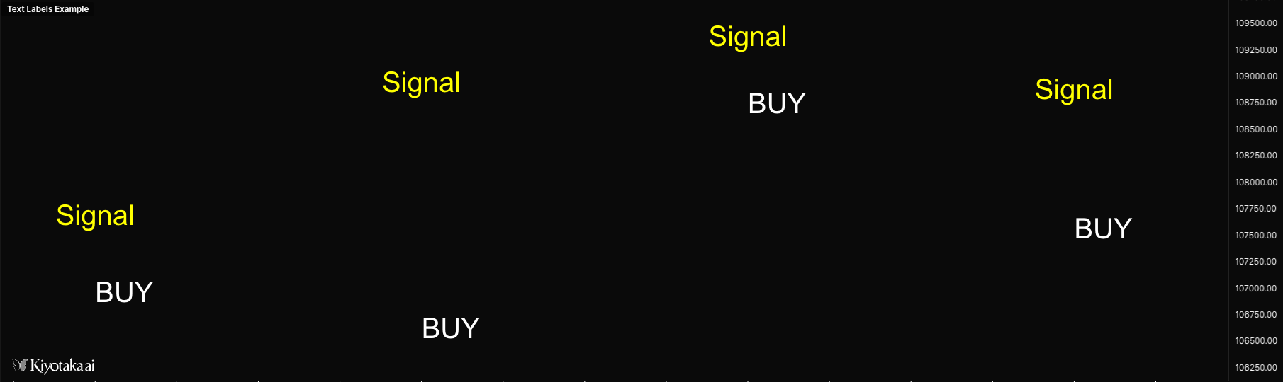
//@version=2

define(title="Text Labels Example", position="offchart", axis=false);

timeseries ohlcvData = ohlcv(symbol=currentSymbol, exchange=currentExchange);

// Display text at specific price level
plotText(text="Signal", color="yellow", price=ohlcvData.close, size=12, xAlign="CENTER", yAlign="CENTER");

// Display text with background
plotText(text="BUY", color="white", price=ohlcvData.low, size=14, xAlign="LEFT", yAlign="BOTTOM", fill=true, backgroundColor="green");

// Display dynamic text with formatting
if (isLastBar) {
    plotText(text="[ Volume Delta ]", color="gray", price=50, size=10, xAlign="LEFT", yAlign="CENTER");
}
plotPriceLabel
Renders a per-bar decorative label anchored at a price level — a callout box, simple text box, or icon (SVG path or image URL). Unlike plotText, it ships with built-in visual styles (callout with leader line + dot, simple centered box, or icon-only) and supports tooltips on hover. Use it for buy/sell flags, signal callouts, level markers, or graphical icons aligned to specific bars.
plotPriceLabel(price, text?, type?, position?, tooltip?, svgPath?, url?, iconSize?, anchorX?, anchorY?, color?, backgroundColor?, fontFamily?, fontWeight?, size?, opacity?) — per-bar decorative label.
| Parameter | Type | Description |
|---|---|---|
price | number | Y-axis price level where the label is anchored |
text | string | Text shown inside the label box. Optional when type="icon-only". |
type | string | "callout" (default — text box + leader line + dot), "simple" (centered text box), or "icon-only" (SVG path or image; requires svgPath or url) |
position | string | Horizontal placement relative to the bar: "left", "center" (default), or "right" |
tooltip | string | Hover tooltip. Use "\n" for line breaks. |
svgPath | string | SVG path "d" attribute for icon-only. Rendered via Canvas Path2D — only path commands, no markup. |
url | string | Image URL for icon-only rendering. Supports static images and animated GIF / WebP, so labels can render looping or animated icons. |
iconSize | number | Icon width/height in CSS px (clamped 4–128, default 16). Distinct from size which controls font size. |
anchorX | string | Horizontal anchor of the icon: "left" (icon extends right), "center" (default), or "right" (icon extends left) |
anchorY | string | Vertical anchor of the icon: "top" (extends down), "center" (default), or "bottom" (extends up — places icon above the price) |
color | string | Text color (or icon fill color for SVG icon-only) |
backgroundColor | string | Background fill behind the label box |
fontFamily | string | Font family for the label text |
fontWeight | number | Text weight, 100–800 in 100 steps (default 400). Out-of-range values are clamped and rounded. |
size | number | Font size in pixels (clamped 1–30, default 12) |
opacity | number | Overall opacity (0–1, default 1). Out-of-range values are clamped. |
//@version=2

define(title="Price Label Examples", position="onchart", axis=true);

timeseries data = ohlcv(symbol=currentSymbol, exchange=currentExchange);

// Callout (default) — text box + leader line + dot
if (data.close > data.open) {
    plotPriceLabel(
        price=data.high,
        text="LONG",
        type="callout",
        color="#ffffff",
        backgroundColor="#22c55e",
        size=14,
        fontWeight=700
    );
}

// Simple — centered text box, no leader, with hover tooltip
if (data.close < data.open) {
    plotPriceLabel(
        price=data.low,
        text="SELL",
        type="simple",
        tooltip="Bearish bar\nopen above close\nshort signal",
        color="#ffffff",
        backgroundColor="#ef4444",
        size=13,
        fontWeight=600
    );
}

// Icon-only — SVG path (Material chevron-up), bar-anchored
var upPath = "M7.41 15.41L12 10.83l4.59 4.58L18 14l-6-6-6 6z";
if (data.close > data.open) {
    plotPriceLabel(
        price=data.high,
        type="icon-only",
        svgPath=upPath,
        iconSize=16,
        anchorY="bottom",
        tooltip="Bullish bar",
        color="#22c55e"
    );
}

// Position variants — pin label to bar left / center / right
plotPriceLabel(price=data.high, text="L", position="left", color="#ffffff", backgroundColor="#3b82f6", size=12);
plotPriceLabel(price=data.high, text="C", position="center", color="#ffffff", backgroundColor="#3b82f6", size=12);
plotPriceLabel(price=data.high, text="R", position="right", color="#ffffff", backgroundColor="#3b82f6", size=12);
plotLabel
Renders a fixed-position label on the chart panel. Unlike plotText, it does not move with price or time, making it better for status text, current values, dashboard labels, and script metadata.
plotLabel(text, position?, x?, y?, color?, size?, xAlign?, yAlign?, fontFamily?, backgroundColor?) — render a fixed-position text label that doesn't move when panning or zooming.
| Parameter | Type | Description |
|---|---|---|
text | string | Text content |
position | string | Anchor: "top_left" / "top_center" / "top_right" / "middle_left" / "middle_center" / "middle_right" / "bottom_left" / "bottom_center" / "bottom_right" |
x | number | X pixel offset from anchor (or absolute X if no position) |
y | number | Y pixel offset from anchor (or absolute Y if no position) |
color | string | Text color (default: "#ffffff") |
size | number | Font size in pixels (default: 12) |
xAlign | string | "LEFT" | "CENTER" | "RIGHT" (auto-set from position) |
yAlign | string | "TOP" | "CENTER" | "BOTTOM" (auto-set from position) |
fontFamily | string | Font family (default: "Arial") |
backgroundColor | string | Background color behind the text |
//@version=2

define(title="Labels Example", position="onchart", axis=false);

timeseries data = ohlcv(symbol=currentSymbol, exchange=currentExchange);

// Display labels at predefined positions
plotLabel(text="Top Left", position="top_left", color="#00ff00", size=14);
plotLabel(text="Top Right", position="top_right", color="#ff0000", size=14);
plotLabel(text="Bottom Center", position="bottom_center", color="#ffff00", size=12);

// Display label with offset from position
plotLabel(text="Offset Label", position="top_left", x=50, y=30, color="#ffffff", size=12);

// Display label at absolute pixel position
plotLabel(text="Absolute Position", x=100, y=200, color="#00ffff", size=16);

// Display dynamic value with background
if (isLastBar) {
    plotLabel(text="Price: " + data.close, position="top_right", color="#ffffff", size=14, backgroundColor="#333333");
}
plotTable
Renders a fixed-position table for compact dashboards and summary panels. Use it to show current indicator values, market stats, symbol/exchange context, or multi-row diagnostic output without tying the display to a price level.
plotTable(data, position?, x?, y?, headerRow?, headerColumn?, textColor?, headerTextColor?, backgroundColor?, headerBackgroundColor?, borderColor?, borderWidth?, fontSize?, cellPadding?, fontFamily?) — fixed-position table.
| Parameter | Type | Description |
|---|---|---|
data | any[][] | 2D array of cell values; each inner array is a row |
position | string | Anchor (same nine values as plotLabel) |
x / y | number | Pixel offset from anchor |
headerRow | boolean | Style first row as header (default: true) |
headerColumn | boolean | Style first column as header (default: false) |
textColor | string | Default text color (default: "#ffffff") |
headerTextColor | string | Header text color (default: "#ffffff") |
backgroundColor | string | Cell background (default: "#1e1e1e") |
headerBackgroundColor | string | Header background (default: "#333333") |
borderColor | string | Border color (default: "#555555") |
borderWidth | number | Border width in pixels (default: 1) |
fontSize | number | Font size in pixels (default: 12) |
cellPadding | number | Cell padding in pixels (default: 8) |
fontFamily | string | Font family (default: "Arial") |
Visual Example

//@version=2

define(title="Tables Example", position="offchart", axis=false);

timeseries data = ohlcv(symbol=currentSymbol, exchange=currentExchange);

if (isLastBar) {
    // Basic OHLC table
    plotTable(
        data=[
            ["Metric", "Value"],
            ["Open", data.open],
            ["High", data.high],
            ["Low", data.low],
            ["Close", data.close]
        ],
        position="top_right",
        headerRow=true
    );

    // Custom styled table
    plotTable(
        data=[
            ["Symbol", currentSymbol],
            ["Exchange", currentExchange]
        ],
        position="middle_center",
        headerColumn=true,
        backgroundColor="#1a1a2e",
        headerBackgroundColor="#16213e",
        borderColor="#0f3460"
    );
}
plotRange
Renders a rectangular region between two timestamps and two price levels. Use it for session ranges, supply/demand zones, liquidity areas, highlighted trade windows, or any boxed region that should stay attached to chart coordinates.
plotRange(time1, price1, time2, price2, color, fillColor) — rectangular box between two time / price points.
| Parameter | Type | Description |
|---|---|---|
time1 | number | Starting timestamp (ms) |
price1 | number | First price level |
time2 | number | Ending timestamp (ms) |
price2 | number | Second price level |
color | string | Border color |
fillColor | string | Fill color (supports transparency) |
Visual Example
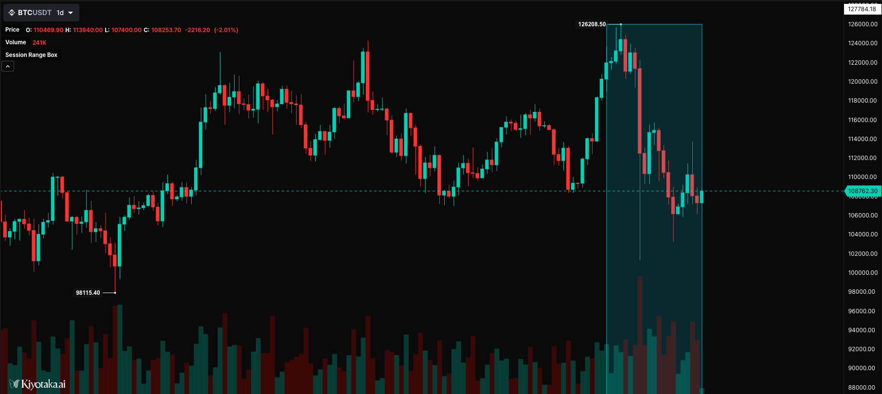
//@version=2

define(title="Session Range Box", position="onchart", axis=false);

timeseries bars = ohlcv(symbol=currentSymbol, exchange=currentExchange);

// Draw a session box highlighting a time range
static sessionStart = 0;
static sessionHigh = 0;
static sessionLow = 1000000;

// Track session high/low
if (bars.high > sessionHigh) {
    sessionHigh = bars.high;
}
if (bars.low < sessionLow) {
    sessionLow = bars.low;
}

// Draw session box at end of period
if (isLastBar) {
    plotRange(
        time1=bars.time - (20 * currentInterval),
        time2=bars.time,
        price1=sessionHigh,
        price2=sessionLow,
        color="#00BCD4",
        fillColor=opacity("#00BCD4", 18)
    );
}
plotMiniChartGrid
Since engine 3.0.46; styling options since 3.0.48. Behavior verified by the engine's passing
g6-request-bars.test.tssuite and a live pan-back test against the chart backend.
Renders a viewport-pinned grid of mini OHLC panels — a multi-timeframe dashboard that sits at a fixed position over the chart (like a legend) instead of being anchored to time/price. Panning or zooming the chart does not move it. Each panel draws its own small candle chart from raw [time, open, high, low, close, volume] rows, which is exactly what requestBars() returns — pair it with anchor: "latest" so every panel shows the current market tail no matter where the user has panned.
plotMiniChartGrid(panels, title?, position?, x?, y?, columns?, panelWidth?, panelHeight?, gap?, backgroundColor?, borderColor?, textColor?, bullColor?, bearColor?, wickColor?, maFastLength?, maFastColor?, maSlowLength?, maSlowColor?, maWidth?, showFastMA?, showSlowMA?, zOrder?, candleStyle?, showChange?, showVolume?)
| Parameter | Type | Description |
|---|---|---|
panels | array | Up to 12 panels, each [label, bars] or { label, bars }. bars is an array of [time, open, high, low, close, volume?] rows; the last 100 rows per panel are kept. Malformed rows error loudly. |
title | string | Grid heading above the panels (omit for none) |
position | string | Viewport anchor: "top_left", "top_center", "top_right" (default), "middle_*", "bottom_*" |
x, y | number | Pixel offset from the anchor (defaults -16, 48; clamped ±2000) |
columns | number | Grid columns, 1–4 (default 2) |
panelWidth | number | Panel width in px, 72–320 (default 128) |
panelHeight | number | Panel height in px, 48–220 (default 72) |
gap | number | Gap between panels in px, 0–48 (default 8) |
backgroundColor | color | Panel background (default #0b0f14e8) |
borderColor | color | Panel border (default #d8dee933) |
textColor | color | Title / panel-label color (default #f7fafc) |
bullColor | color | Up candle / volume / badge color (default #13a983) |
bearColor | color | Down candle / volume / badge color (default #e35d6a) |
wickColor | color | Candle wick color (default #d8dee9) |
candleStyle | string | "candles" (default) | "hollow" (bull bodies outlined) | "bars" (OHLC tick bars) | "line" | "area" (close-only sparkline, colored by the panel's net direction). An unknown value is a loud error, not a silent fallback. |
maFastLength | number | Fast SMA period drawn over each panel's closes (omit for none) |
maFastColor | color | Fast MA color (default #f7c948) |
maSlowLength | number | Slow SMA period (omit for none) |
maSlowColor | color | Slow MA color (default #60a5fa) |
maWidth | number | MA stroke width, 0.5–5 (default 1.4) |
showFastMA | boolean | Toggle the fast MA (default true when a length is set) |
showSlowMA | boolean | Toggle the slow MA (default true when a length is set) |
showChange | boolean | Per-panel % change badge (first open → last close of the panel's rows), bull/bear colored (default false) |
showVolume | boolean | Volume histogram strip along the bottom of each panel from the rows' volume column; the price area compresses only when volume exists (default false) |
zOrder | number | Stacking order among viewport overlays |
The grid is render-only: it costs no data-source budget by itself (the requestBars() calls that feed it are the sources). The overlay auto-scales down if the grid would exceed roughly 42% of the viewport width or 48% of its height, so oversized grids shrink instead of covering the chart. One grid is emitted per call site; calling again on a later bar replaces the previous payload, which is why it is normally drawn inside if (isLastBar) { ... }.
//@version=2
define("Minicharts Multi-TF", "onchart", false, maxBarsBack=80)
timeseries data = ohlcv(currentSymbol, currentExchange)

if (isLastBar) {
  var bars15m = requestBars(currentSymbol, "15m", "ohlcv", currentExchange, { bars: 18, anchor: "latest" })
  var bars1h  = requestBars(currentSymbol, "1h",  "ohlcv", currentExchange, { bars: 18, anchor: "latest" })
  var bars4h  = requestBars(currentSymbol, "4h",  "ohlcv", currentExchange, { bars: 18, anchor: "latest" })
  var bars1d  = requestBars(currentSymbol, "1d",  "ohlcv", currentExchange, { bars: 18, anchor: "latest" })

  plotMiniChartGrid(
    panels=[["15m", bars15m], ["1h", bars1h], ["4h", bars4h], ["1d", bars1d]],
    title=currentSymbol,
    position="top_right",
    columns=2,
    panelWidth=160,
    panelHeight=92,
    maFastLength=9,
    maSlowLength=21,
    showChange=true,
    showVolume=true
  )
}
Because the panels are fed by anchor: "latest" requests, they keep showing the newest 18 bars per timeframe while the user pans years back through history, and they update live as bars form and close.
plotMiniChartGrid
Not yet rendered on the platform. The production chart renderer has no mini-chart-grid surface yet: on kiyotaka.ai this output kind does not draw. The engine computes and emits it, so scripts using it compile and run, but do not rely on it visually until the renderer ships.
Renders a viewport-pinned grid of mini OHLC panels — a multi-timeframe dashboard that sits at a fixed position over the chart (like a legend) instead of being anchored to time/price. Panning or zooming the chart does not move it. Each panel draws its own small candle chart from raw [time, open, high, low, close, volume] rows, which is exactly what requestBars() returns — pair it with anchor: "latest" so every panel shows the current market tail no matter where the user has panned.
plotMiniChartGrid(panels, title?, position?, x?, y?, columns?, panelWidth?, panelHeight?, gap?, backgroundColor?, borderColor?, textColor?, bullColor?, bearColor?, wickColor?, maFastLength?, maFastColor?, maSlowLength?, maSlowColor?, maWidth?, showFastMA?, showSlowMA?, zOrder?, candleStyle?, showChange?, showVolume?)
| Parameter | Type | Description |
|---|---|---|
panels | array | Up to 12 panels, each [label, bars] or { label, bars }. bars is an array of [time, open, high, low, close, volume?] rows; the last 100 rows per panel are kept. Malformed rows error loudly. |
title | string | Grid heading above the panels (omit for none) |
position | string | Viewport anchor: "top_left", "top_center", "top_right" (default), "middle_*", "bottom_*" |
x, y | number | Pixel offset from the anchor (defaults -16, 48; clamped ±2000) |
columns | number | Grid columns, 1–4 (default 2) |
panelWidth | number | Panel width in px, 72–320 (default 128) |
panelHeight | number | Panel height in px, 48–220 (default 72) |
gap | number | Gap between panels in px, 0–48 (default 8) |
backgroundColor | color | Panel background (default #0b0f14e8) |
borderColor | color | Panel border (default #d8dee933) |
textColor | color | Title / panel-label color (default #f7fafc) |
bullColor | color | Up candle / volume / badge color (default #13a983) |
bearColor | color | Down candle / volume / badge color (default #e35d6a) |
wickColor | color | Candle wick color (default #d8dee9) |
candleStyle | string | "candles" (default) | "hollow" (bull bodies outlined) | "bars" (OHLC tick bars) | "line" | "area" (close-only sparkline, colored by the panel's net direction). An unknown value is a loud error, not a silent fallback. |
maFastLength | number | Fast SMA period drawn over each panel's closes (omit for none) |
maFastColor | color | Fast MA color (default #f7c948) |
maSlowLength | number | Slow SMA period (omit for none) |
maSlowColor | color | Slow MA color (default #60a5fa) |
maWidth | number | MA stroke width, 0.5–5 (default 1.4) |
showFastMA | boolean | Toggle the fast MA (default true when a length is set) |
showSlowMA | boolean | Toggle the slow MA (default true when a length is set) |
showChange | boolean | Per-panel % change badge (first open → last close of the panel's rows), bull/bear colored (default false) |
showVolume | boolean | Volume histogram strip along the bottom of each panel from the rows' volume column; the price area compresses only when volume exists (default false) |
zOrder | number | Stacking order among viewport overlays |
The grid is render-only: it costs no data-source budget by itself (the requestBars() calls that feed it are the sources). The overlay auto-scales down if the grid would exceed roughly 42% of the viewport width or 48% of its height, so oversized grids shrink instead of covering the chart. One grid is emitted per call site; calling again on a later bar replaces the previous payload, which is why it is normally drawn inside if (isLastBar) { ... }.
//@version=2
define("Minicharts Multi-TF", "onchart", false, maxBarsBack=80)
timeseries data = ohlcv(currentSymbol, currentExchange)

if (isLastBar) {
  var bars15m = requestBars(currentSymbol, "15m", "ohlcv", currentExchange, { bars: 18, anchor: "latest" })
  var bars1h  = requestBars(currentSymbol, "1h",  "ohlcv", currentExchange, { bars: 18, anchor: "latest" })
  var bars4h  = requestBars(currentSymbol, "4h",  "ohlcv", currentExchange, { bars: 18, anchor: "latest" })
  var bars1d  = requestBars(currentSymbol, "1d",  "ohlcv", currentExchange, { bars: 18, anchor: "latest" })

  plotMiniChartGrid(
    panels=[["15m", bars15m], ["1h", bars1h], ["4h", bars4h], ["1d", bars1d]],
    title=currentSymbol,
    position="top_right",
    columns=2,
    panelWidth=160,
    panelHeight=92,
    maFastLength=9,
    maSlowLength=21,
    showChange=true,
    showVolume=true
  )
}
Because the panels are fed by anchor: "latest" requests, they keep showing the newest 18 bars per timeframe while the user pans years back through history, and they update live as bars form and close.
plotStatRow
plotStatRow() adds one row to the per-bar statistics strip under the price
pane. Use it for compact values that should track each candle but should not
become a new price series: volume, delta, cumulative delta, funding, open
interest, liquidation totals, range, or any custom per-bar score.
plotStatRow(value, title?, format?, polarity?, priority?, colors?)
| Parameter | Type | Description |
|---|---|---|
value | number / timeseries | The per-bar value shown in the strip. |
title | string | Row label shown in the strip gutter. |
format | string | "si" (default), "signedSi", "percent", "price", or "raw". |
polarity | string | "magnitude" (default), "diverging", or "none"; controls how heat/color emphasis is interpreted. |
priority | number | 1, 2, or 3; priority 1 rows keep readable text longest as bars get narrow. |
colors | string[] | Optional palette override for the row. |
Statistics rows are decorator outputs: they do not own a pane, do not draw a line, and do not affect the price scale. The chart renderer mounts them with the candle timeline so each cell lines up with the bar it describes.
//@version=2
define("Stats Row Example", "onchart", false, maxBarsBack=80)
timeseries trade = ohlcv(currentSymbol, currentExchange)

var delta = trade.close - trade.open
var rangePct = trade.open == 0 ? na : ((trade.high - trade.low) / trade.open) * 100

plotStatRow(
  trade.volume,
  title="Volume",
  format="si",
  polarity="magnitude",
  priority=1,
  colors=["#60a5fa"]
)
plotStatRow(
  delta,
  title="Delta",
  format="signedSi",
  polarity="diverging",
  priority=1
)
plotStatRow(
  rangePct,
  title="Range %",
  format="percent",
  polarity="magnitude",
  priority=2
)
hline - Horizontal Line
Renders a fixed horizontal reference line, commonly used for thresholds like RSI overbought/oversold levels, zero lines, midlines, or static support/resistance levels.
hline(value, color?, width?) — horizontal reference line at a fixed value.
| Parameter | Type | Description |
|---|---|---|
value | number | Y-axis value where the line is drawn |
color | string | Line color (default: "gray") |
width | number | Line width (default: 1) |
Visual Example
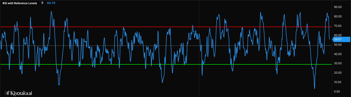
//@version=2

define(title="RSI with Reference Levels", position="offchart", axis=true);

timeseries ohlcvData = ohlcv(symbol=currentSymbol, exchange=currentExchange);

// Calculate RSI
var rsiValue = rsi(source=ohlcvData.close, period=14);

// Plot RSI
plotLine(value=rsiValue, width=2, colors=["#2196f3"], fill=false, smooth=true, label=["RSI"], desc=["14-period RSI"]);

// Basic horizontal lines for reference levels
hline(value=70, color="#ff0000", width=2);  // Red line at 70 (overbought)
hline(value=30, color="#00ff00", width=2);  // Green line at 30 (oversold)
hline(value=50, color="#808080", width=1);  // Gray midline at 50
plotBgColor
Applies a background color for the current bar or condition. Use it to highlight regimes, overbought/oversold zones, volatility states, or signal windows behind the plotted data.
plotBgColor(color, forceOnChart?) — apply a background color band.
| Parameter | Type | Description |
|---|---|---|
color | string | Background color (CSS-style, supports transparency via 8-digit hex) |
forceOnChart | boolean | Render on the main chart even when this script is offchart |
Visual Example
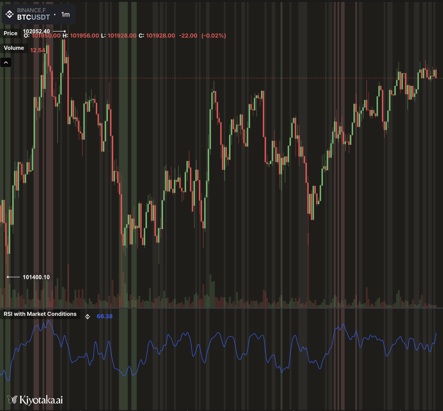
//@version=2

define(title="RSI with Market Conditions", position="offchart", axis=true);

// ==================== INPUTS ====================
// RSI Settings
var rsiPeriod = input(name="rsi_period", type="number", defaultValue=14, label="RSI Period", constraints={min: 2, max: 100});
var overboughtLevel = input(name="overbought", type="number", defaultValue=70, label="Overbought Level", constraints={min: 50, max: 100});
var oversoldLevel = input(name="oversold", type="number", defaultValue=30, label="Oversold Level", constraints={min: 0, max: 50});

// Visual Settings
var showZones = input(name="show_zones", type="boolean", defaultValue=true, label="Show Zone Lines");
var rsiColor = input(name="rsi_color", type="color", defaultValue="#2962FF", label="RSI Line Color");
var lineWidth = input(name="width", type="number", defaultValue=2, label="Line Width", constraints={min: 1, max: 5});

// ==================== DATA & CALCULATIONS ====================
timeseries ohlcvData = ohlcv(symbol=currentSymbol, exchange=currentExchange);

// Calculate RSI
var rsiValue = rsi(source=ohlcvData, period=rsiPeriod);

// ==================== BACKGROUND COLORS ====================
// Determine market condition && apply appropriate background
if (rsiValue < 20) {
    // Extreme oversold - strong green (best buying opportunity)
    plotBgColor(color="rgba(76, 175, 80, 0.3)");
    plotBgColor(color="rgba(76, 175, 80, 0.3)", forceOnChart=true);
} else if (rsiValue < oversoldLevel) {
    // Oversold - light green (potential buying opportunity)
    plotBgColor(color="rgba(129, 199, 132, 0.2)");
    plotBgColor(color="rgba(129, 199, 132, 0.2)", forceOnChart=true);
} else if (rsiValue > 80) {
    // Extreme overbought - strong red (best selling opportunity)
    plotBgColor(color="rgba(244, 67, 54, 0.3)");
    plotBgColor(color="rgba(244, 67, 54, 0.3)", forceOnChart=true);
} else if (rsiValue > overboughtLevel) {
    // Overbought - light red (potential selling opportunity)
    plotBgColor(color="rgba(239, 154, 154, 0.2)");
    plotBgColor(color="rgba(239, 154, 154, 0.2)", forceOnChart=true);
} else if (rsiValue > 45 && rsiValue < 55) {
    // Neutral zone - very light gray
    plotBgColor(color="rgba(158, 158, 158, 0.1)");
    plotBgColor(color="rgba(158, 158, 158, 0.1)", forceOnChart=true);
}

// ==================== PLOTTING ====================
// Plot RSI line
plotLine(
    value=rsiValue,
    colors=[rsiColor],
    width=lineWidth,
    smooth=true,
    label=["RSI"],
    desc=["Relative Strength Index"]
);
fillBetween
Shades the area between two plotted series, with a per-bar color. Use it for moving-average ribbons, band envelopes, and above/below-zero delta fills.
fillBetween(series1, series2, color, opacity?) — fill between two plotted series.
| Parameter | Type | Description |
|---|---|---|
series1 | timeseries | First boundary. Must be a named timeseries that the script also plots. |
series2 | timeseries | Second boundary. Same requirement as series1. |
color | string | Fill color, evaluated per bar (a conditional expression segments the fill). |
opacity | number | 0 to 1 (values above 1 clamp to fully opaque). Defaults to 0.25. |
Both series must be plotted. A fill carries no y-data of its own: the renderer takes its geometry from the two plotted series it references. Plot each boundary with plotLine/plot first (an ordinary visible line, or a subtle one), then call fillBetween with the same variables. If a referenced series is never plotted, the fill is skipped and the Problems panel reports fillBetween references '<name>', which is never plotted.
The color argument re-evaluates every bar, so one call renders a sign-colored fill: pass a conditional and the fill switches color per bar.
//@version=2
define(title="Delta Zero Fill", position="offchart", axis=true);

timeseries ohlcvData = ohlcv(symbol=currentSymbol, exchange=currentExchange);
timeseries closeSeries = ohlcvData.close;
timeseries delta = closeSeries - sma(source=closeSeries, period=20);
timeseries zero = delta * 0;

plotLine(value=delta, colors=["#e2e8f0"], width=1, label=["Delta"], desc=["Close minus its 20-bar average"]);
plotLine(value=zero, colors=["#64748b"], width=1, label=["Zero"], desc=["Zero baseline"]);
fillBetween(series1=delta, series2=zero, color=delta >= 0 ? "#22c55e" : "#ef4444", opacity=0.15);
fillBetween is an annotation, so it takes no label/desc of its own; the two plotted boundary series carry the labels.
fillBetween
Shades the area between two plotted series, with a per-bar color. Use it for moving-average ribbons, band envelopes, and above/below-zero delta fills.
fillBetween(series1, series2, color, opacity?) — fill between two plotted series.
| Parameter | Type | Description |
|---|---|---|
series1 | timeseries | First boundary. Must be a named timeseries that the script also plots. |
series2 | timeseries | Second boundary. Same requirement as series1. |
color | string | Fill color, evaluated per bar (a conditional expression segments the fill). |
opacity | number | 0 to 1 (values above 1 clamp to fully opaque). Defaults to 0.25. |
Both series must be plotted. A fill carries no y-data of its own: the renderer takes its geometry from the two plotted series it references. Plot each boundary with plotLine/plot first (an ordinary visible line, or a subtle one), then call fillBetween with the same variables. If a referenced series is never plotted, the fill is skipped and the Problems panel reports fillBetween references '<name>', which is never plotted.
The color argument re-evaluates every bar, so one call renders a sign-colored fill: pass a conditional and the fill switches color per bar.
//@version=2
define(title="Delta Zero Fill", position="offchart", axis=true);

timeseries ohlcvData = ohlcv(symbol=currentSymbol, exchange=currentExchange);
timeseries closeSeries = ohlcvData.close;
timeseries delta = closeSeries - sma(source=closeSeries, period=20);
timeseries zero = delta * 0;

plotLine(value=delta, colors=["#e2e8f0"], width=1, label=["Delta"], desc=["Close minus its 20-bar average"]);
plotLine(value=zero, colors=["#64748b"], width=1, label=["Zero"], desc=["Zero baseline"]);
fillBetween(series1=delta, series2=zero, color=delta >= 0 ? "#22c55e" : "#ef4444", opacity=0.15);
fillBetween is an annotation, so it takes no label/desc of its own; the two plotted boundary series carry the labels.
The label requirement
Every plot that draws a data series must carry a label=[...], one entry per series, and each label must be unique across all of the script's plotted outputs. The label is the output's identity: it populates the legend and is how you pick the output when you set an alert on it, so the editor blocks a publish whose labels are missing, blank, or duplicated. desc=[...] (a longer per-series description) is optional and is not validated, so you can omit it.
The rule applies to plot, plotLine, plotShape, plotCandle, plotBar, and plotHistogram. For a single series, pass a one-element array (label=["RSI"]); for a multi-series plot like plotCandle, the array length must match the series count (four for OHLC).
Annotation and overlay functions do not take label / desc, because they aren't series: plotText, plotTable, hline, barcolor, and fillBetween are fine without them.
Here is one script that renders every common type correctly, each series plot carrying a unique label (and an optional desc):
//@version=2
define(title="Renderers", position="offchart", axis=true)

timeseries trade = ohlcv(symbol=currentSymbol, exchange=currentExchange)
timeseries closeSeries = trade.close
timeseries highSeries = trade.high
timeseries lowSeries = trade.low
timeseries volumeSeries = trade.volume

timeseries fast = sma(source=closeSeries, period=5)
timeseries slow = sma(source=closeSeries, period=13)
var shapeValue = closeSeries > fast ? highSeries : lowSeries
var candleColor = closeSeries >= trade.open ? "#059669" : "#dc2626"

plot(value=closeSeries, plotType="line", colors=["#2563eb"], width=2, label=["Close Line"], desc=["Universal plot line"])
plotLine(value=fast, colors=["#7c3aed"], width=2, label=["Fast SMA"], desc=["plotLine fast average"])
plotShape(value=shapeValue, shape="circle", colors=["#f97316"], width=3, fill=true, label=["Shape"], desc=["plotShape marker"])
plotText(text="close", color="#111827", price=highSeries, size=12)
plotTable(data=[["field", "value"], ["barIndex", barIndex], ["last", isLastBar]], position="top_right")
plotCandle(value=trade, colors=["#059669", "#dc2626"], width=1, label=["Open", "High", "Low", "Close"], desc=["plotCandle open", "plotCandle high", "plotCandle low", "plotCandle close"])
plotBar(value=volumeSeries, colors=["#0891b2", "#f97316"], width=1, label=["Volume"], desc=["plotBar volume"])
hline(value=100, color="#6b7280", width=1)
barcolor(color=candleColor)
plotLine(value=slow, colors=["#16a34a"], width=2, label=["Slow SMA"], desc=["plotLine slow average for fill context"])
fillBetween(series1=fast, series2=slow, color="#94a3b8", opacity=0.2)
What the build tells you when a label is wrong
The errors are specific, so they're easy to fix:
- Drop
labelon a line and the build stops withPlot function 'line' is missing the 'label' parameter. Expected 1 label(s) for 1 data series. - Give a four-series
plotCandleonly one label and it fails withPlot function 'candle' has insufficient labels. Expected 4 label(s) but got 1.The fix is one entry per series. - Leave a label blank (
label=[""]) and you getPlot function 'line' has an empty 'label'. Every plotted output needs a non-empty, unique label. - Reuse a name across outputs and the build stops with
Duplicate plot label 'Close'. Each plotted output needs a unique label so it can be told apart (e.g. when setting an alert on it).
desc is optional and is not validated, so omitting it never blocks the build.